Here’s the second instalment of the new series on our blog – Featured Users.
The series where we put the spotlight on some users of our Plugmatter Optin Feature Box Plugin, and how they’re using our plugins creatively for their blogging needs.
Let’s learn a bit about them, how they’ve customized their feature boxes to their requirements and what they have to say about our plugin.

Enchanting Marketing, as the name suggests, is all about skyrocketing your business with sharp, astute online marketing efforts. The blog contains free resources to improve your writing, and your business, in the form of tutorials, courses on business blogging, on how to write persuasive copy, and regular blog posts that address and solve blogger issues.
Henneke Duistermaat is a copywriter and marketer, with a motive to add sparkle to boring business blogs. She’s also the author of two top rated books about writing and blogging, and a regular contributor to popular marketing blogs like KISSmetrics and Copyblogger.
The template used is mini_Elegance, on the blog page of her website. The mini feature box entirely violet-colored with a bright, contrasting orange CTA button. It’s clutter-free, not having any irrelevant notes or images. It informs visitors of her free ‘snackable’ writing course, which gives you easy-to-implement tips, all to win you more customers. The details and benefits of the course are put across precisely, and with brevity.
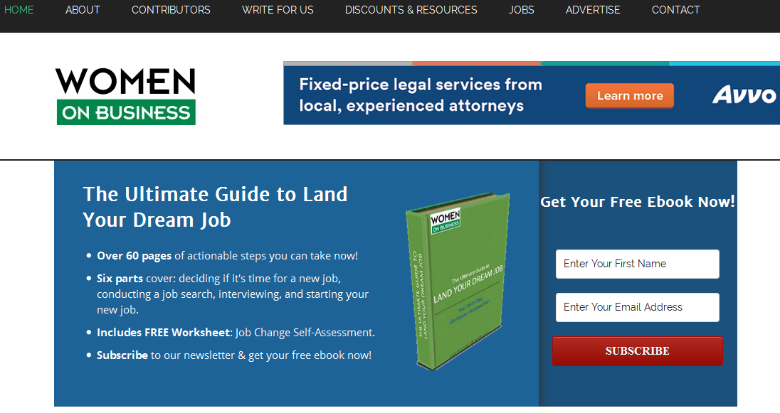
Being an online destination for news and information women need to run successful businesses, Women on Business aims to bridge any existing gap between today’s male and female business moguls. The blog delivers valuable tricks of the trade, as well as career and educational resources to an audience of business women of all kinds, from solopreneurs to corporate executives.
Susan Gunelius, is the President & CEO of KeySplash Creative, Inc., a marketing communications company. Along with an MBA in Management and Strategy, Susan brings over 20 years of marketing experience to her blog , with her employers being some of the largest corporations in the world, including divisions of AT&T, HSBC and more.
The template used in the feature box is eCover. It showcases her ebook – The Ultimate Guide to Land Your Dream Job. The blue used in it is elsewhere on the page too, branding the feature box. The points are written in bold, to grab attention to them. The red CTA button stands out against the blue background, being the only warm color on it, to encourage clicks.
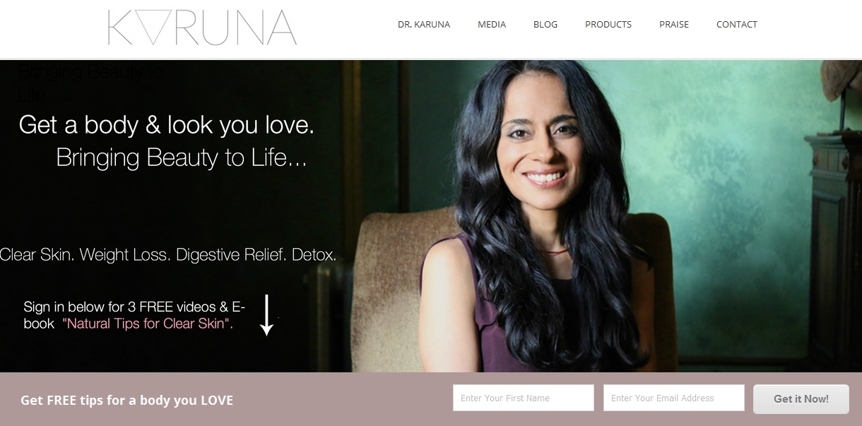
Karuna Naturopathic is a healthcare blog about “bringing beauty to life”, motivating readers through struggles to make them feel good in their own body. It covers concerns about skin care, weight loss, overall health, etc. and also provides solutions in the form of products, like her collagen generator, 14-day detox plan, and more.
Dr. Karuna Sabnani is a beauty and natural medicine expert with over 10 years of experience in the field. A graduate of Southwest College of Naturopathic Medicine, she received her Bachelor of Arts degree in Psychology and English Literature. Dr. Sabnani is a licensed Naturopathic Doctor in the state of California, and is also a member of the California Association of Naturopathic Doctors.
The template used in her feature box is Sleek, and has a dark background, in contrast with the light tones used on the rest of the page. It covers the entire width of the screen, to be easily noticed by readers. The button copy uses the action-oriented text “Get it Now!”, to motivate subscriptions.
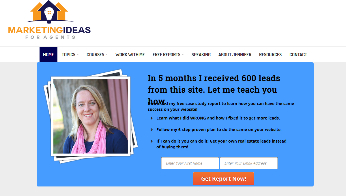
Marketing Ideas For Agents, as the name suggests, is all about marketing tips and lessons for real estate agents, to improve and grow their businesses. It covers email marketing, client marketing and lead conversion, among other topics. Reports on different marketing strategies that are mentioned, help agents grow and choose strategies for themselves.
Jennifer Snyder serves over 2,000 real estate agents, business owners and professionals by providing them with marketing tips, tools, classes, resources to build their careers.
The blog helps make online marketing even more interesting an endeavour. An ambassador and permanent contributor on Inman News, Jennifer has been featured on Katie Lance Consulting, Internet Business Mastery, etc.
The template used is HDi_Potrait, on her homepage. It has a calm, but distinctive blue background, and shows shows how Jennifer got 600 leads from her own site. The sub-points are concise and direct, and relatable, “What I did WRONG and how I fixed it…”. A contrasting orange button, which is the opposite of blue in the color wheel, makes it stand out on the feature box and incentivizes visitors to click it.
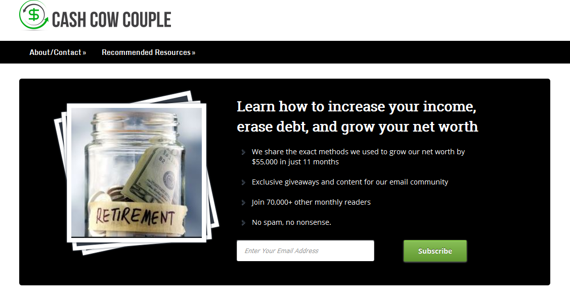
Cash Cow Couple is all about money management and how to save better, and save more. You will learn how to increase your income and net worth, while minimizing debt. With a lot of content about taxation and major concerns that common people face, Cash Cow Couple has a lot to offer anyone, in terms of financial advice.
Run together by Jacob and Vanessa, they talk exclusively about about relationships, financial freedom, personal financial planning, and related topics. Through real toil and effort, they paid off about $25,000 in student loans while increasing their net worth by more than $50,000 in the first year of their marriage. That growth has increased since.
The template used is HDi_Portrait, and it features advice on how to save money for retirement, with effective strategies to do the same. The black background adds simplicity and also an earnestness about the effectiveness of their advice. The key features are highlighted in the description, and also mention that it will be a spam-free service. The CTA button asking visitors to subscribe is green, which is generally held as motivating positive action and and encouraging trust.
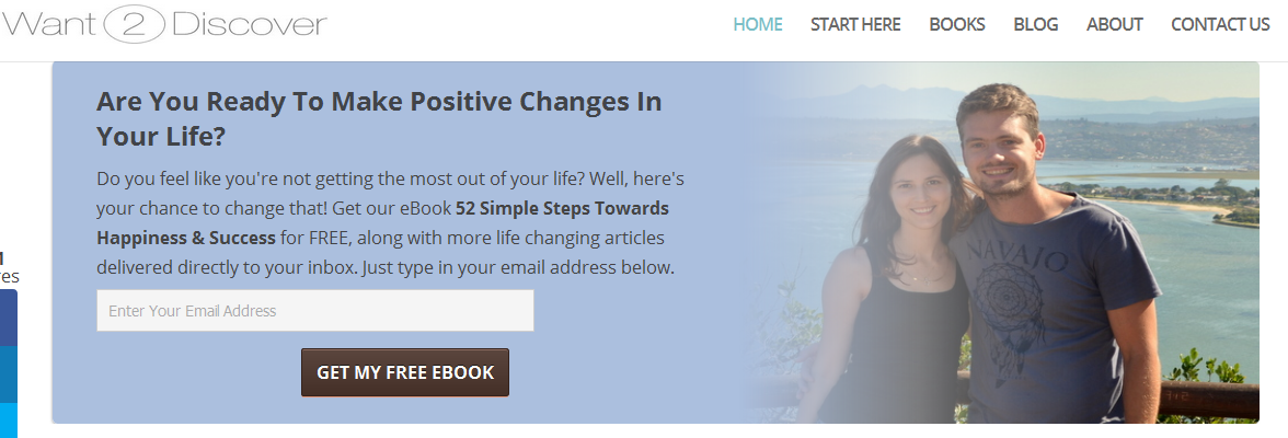
Want2discover is about life and happiness, aiming to help you be a confident, strong and independent person. There are quality articles about positive actions, living a meaningful life, letting go of negativity, etc. and is a place to get readers to discover themselves and their potential.
Bastian and Chantelle are the two forces behind the blog. Pooling in their life experiences with relationships and finding purpose to their lives, lead them to come up with Wan2Discover. “Life is a journey and we want to walk alongside you on that journey, and help you discover a meaningful and happy life.” Bastian and Chantelle seek to help people in small, significant steps towards living a fuller a life.
The template used in the feature box is Gradient. It asks readers if they are ready to make positive changes in their lives, with the descriptions illustrating how their free ebook can help make those changes. They’ve placed a warm, smiling image of them to the right, to build trust and make visitors feel welcome. And the pleasant, pale purple is in line with the aesthetic of their blog design as such.
Get weekly actionable tips, insights and case studies to maximize your results.